Visualising Time Tracking Data
Several experiments with data from a time tracking app
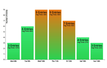
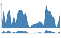
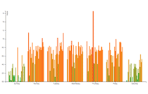
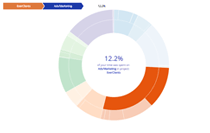
These experiments were written as part of an investigation into the time I've recorded each and every day for the past few years. My hope was to discover new ways of looking at the time I spend at a computer, to better understand what 'work' makes me happy, stressed or bored.
All of the examples here are interactive, (you'll need to be a Toggl user), and you can test them out with your own time-tracking data simply by entering your API Key and Workspace ID. Further I've written a tutorial over at WebDesignerDepot[Link To Follow] which guides you through creating visualisations like these using the Toggl API and the d3.js library.
Each of these visualisations is interactive (if you use Toggl). You can test the graphs out with your data by clicking the "Try with your data" button above each visualisation. From there just enter your API Key and choose a date range! Once you've tried them out, Tweet your findings!
Tracking your Time & Visualising the Data: Useful Links
- Time Tracking Software List (App List)
- Time Tracking for Freelancers (Article)


